 3c2ce40afd
* web: Add InvalidationFlow to Radius Provider dialogues

## What

- Bugfix: adds the InvalidationFlow to the Radius Provider dialogues
  - Repairs: `{"invalidation_flow":["This field is required."]}` message, which was *not* propagated
    to the Notification.
- Nitpick: Pretties `?foo=${true}` expressions: `s/\?([^=]+)=\$\{true\}/\1/`

## Note

Yes, I know I'm going to have to do more magic when we harmonize the forms, and no, I didn't add the
Property Mappings to the wizard, and yes, I know I'm going to have pain with the *new* version of
the wizard. But this is a serious bug; you can't make Radius servers with *either* of the current
dialogues at the moment.

* This (temporary) change is needed to prevent the unit tests from failing.

\# What

\# Why

\# How

\# Designs

\# Test Steps

\# Other Notes

* Revert "This (temporary) change is needed to prevent the unit tests from failing."

This reverts commit dddde09be5.

* web/admin: Provide `hidden` text and textarea components

## Details

This commit provides two new elements (technically, since they're API-unaware), one for `<input
type="text">`, and one for `<textarea>`, that provide for the ability to create fields that are (or
can be) hidden. A new boolean attribute, `revealed`, shows the state of the component (the content
is therefore *not* revealed by default).

It also includes a third new element, `ak-visibility-toggle`, that creates a hide/show toggle with
all the right icons, styling, and eventing.  It's straightforward, and isolating it improved the
DX of everything that uses that feature by quite a bit.

Storybook stories (with autodoc documentation) have been provided for `ak-hidden-text-input`,
`ak-hidden-textarea-input`, and `ak-visibility-toggle`.

## Maintenance Notice

As a maintenance detail, the field `ak-private-text` has been renamed `ak-secret-text` to reflect
its usage, and the places where it was used have all been changed to reflect that update.

* web/component: embed styling (for now) to handle the lightDom/shadowDom/slot conflicts in HorizontalLightComponent and HorizontalFormElement

* Comments and Types. I really shouldn't have to catch this stuff with my eyeballs.

* fix typo

Signed-off-by: Jens Langhammer <jens@goauthentik.io>

---------

Signed-off-by: Jens Langhammer <jens@goauthentik.io>
Co-authored-by: Jens Langhammer <jens@goauthentik.io>
What is authentik?
authentik is an open-source Identity Provider that emphasizes flexibility and versatility, with support for a wide set of protocols.
Our enterprise offer can also be used as a self-hosted replacement for large-scale deployments of Okta/Auth0, Entra ID, Ping Identity, or other legacy IdPs for employees and B2B2C use.
Installation
For small/test setups it is recommended to use Docker Compose; refer to the documentation.
For bigger setups, there is a Helm Chart here. This is documented here.
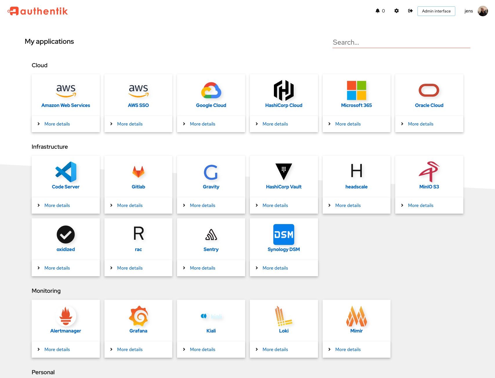
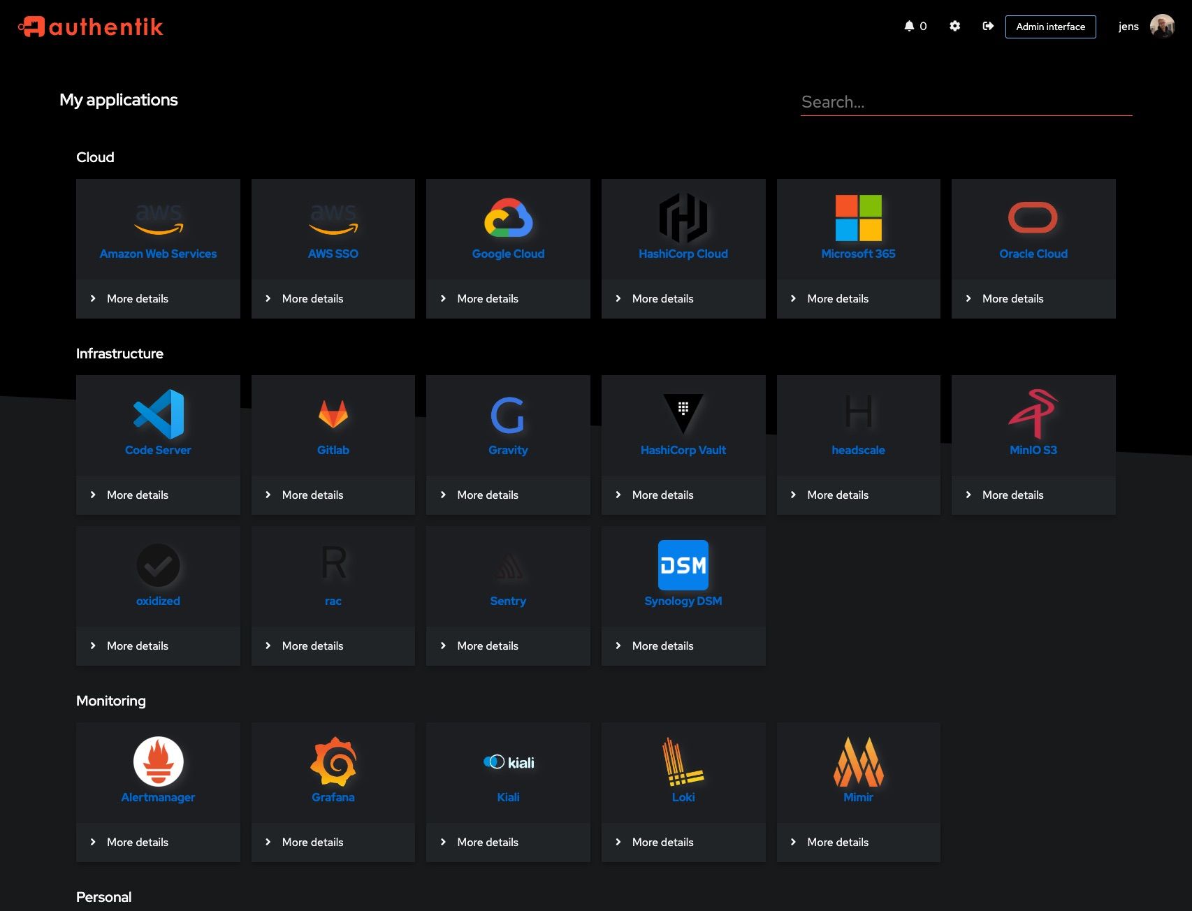
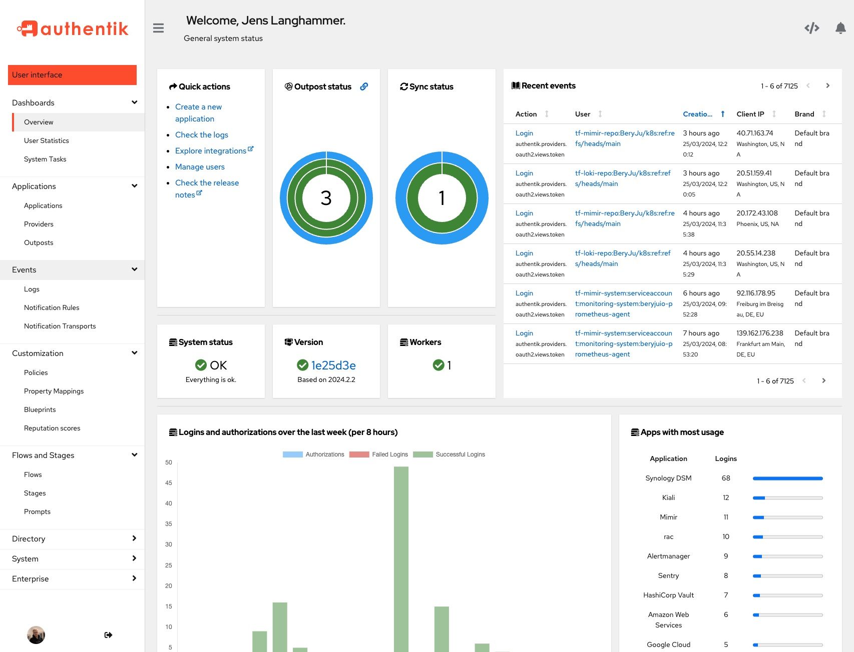
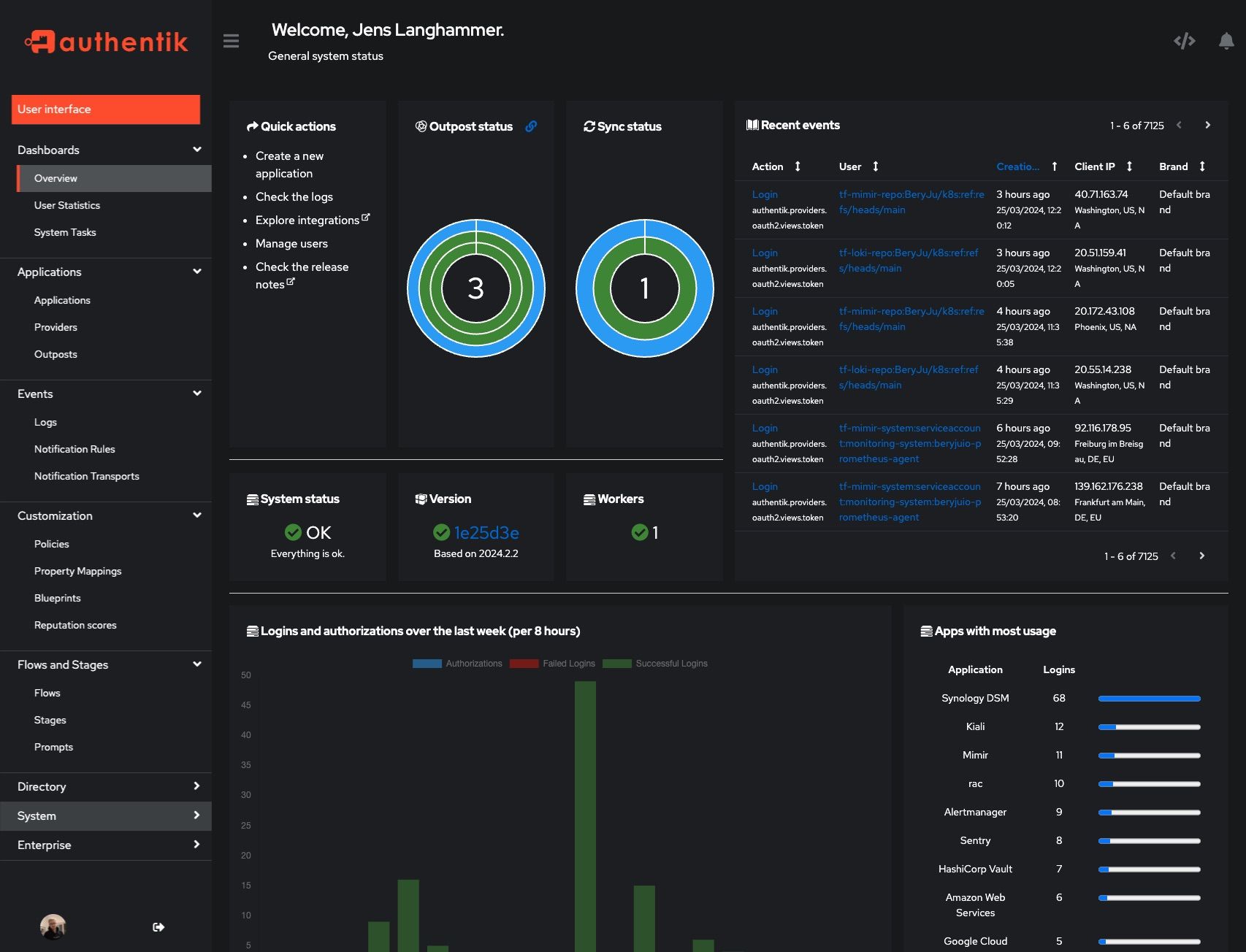
Screenshots
| Light | Dark |
|---|---|
 |
 |
 |
 |
Development
Security
See SECURITY.md
Adoption and Contributions
Your organization uses authentik? We'd love to add your logo to the readme and our website! Email us @ hello@goauthentik.io or open a GitHub Issue/PR! For more information on how to contribute to authentik, please refer to our contribution guide.